SaaS Design System
Bringing Order to Chaos
Designing a unified design system for the HCL Unica+ marketing suite. A 15+ product enterprise platform where no two screens spoke the same language, and how we gave it one.
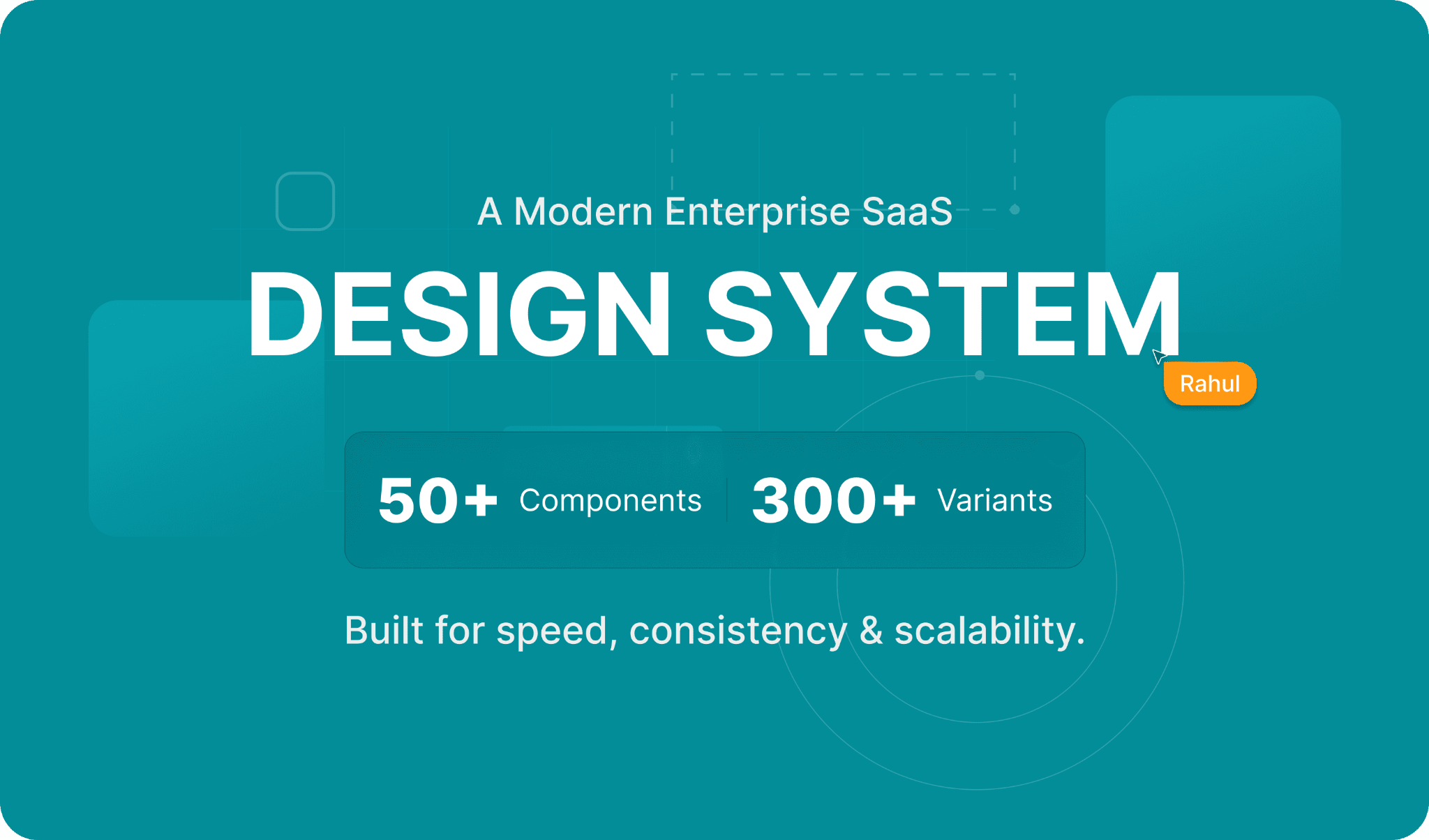
01 · Product Overview
Project Details
- Role
- Senior Product Designer: Owned system vision, audit, token architecture, core components, documentation, governance, and adoption.
- Product
- Design system for a 15+ product Martech suite
- Platform
- Enterprise web, marketing automation SaaS
- Skills
- Design systems, Design tokens, Component libraries, Accessibility (WCAG AA), Governance, Design-to-dev workflow
- Team
- 2 designers, 5 engineers, 3 product managers
- Timeline
- ~4 months to v1, ongoing governance
Executive Summary
HCL Unica+ is sold as one unified marketing platform, but 15+ products built by different teams over the years looked and behaved like different apps. That inconsistency slowed every team: designers redlined from scratch, engineers rebuilt the same components, QA caught avoidable bugs late, and the product demoed poorly against competitors.
We built the design system that fixed this at the root: one token architecture, one component library, one set of rules, adopted across the suite. Result: 50% faster design-to-dev handoff, 60% fewer UI defects, and a suite that finally demos and sells as one product.
02 · Overview
About the System
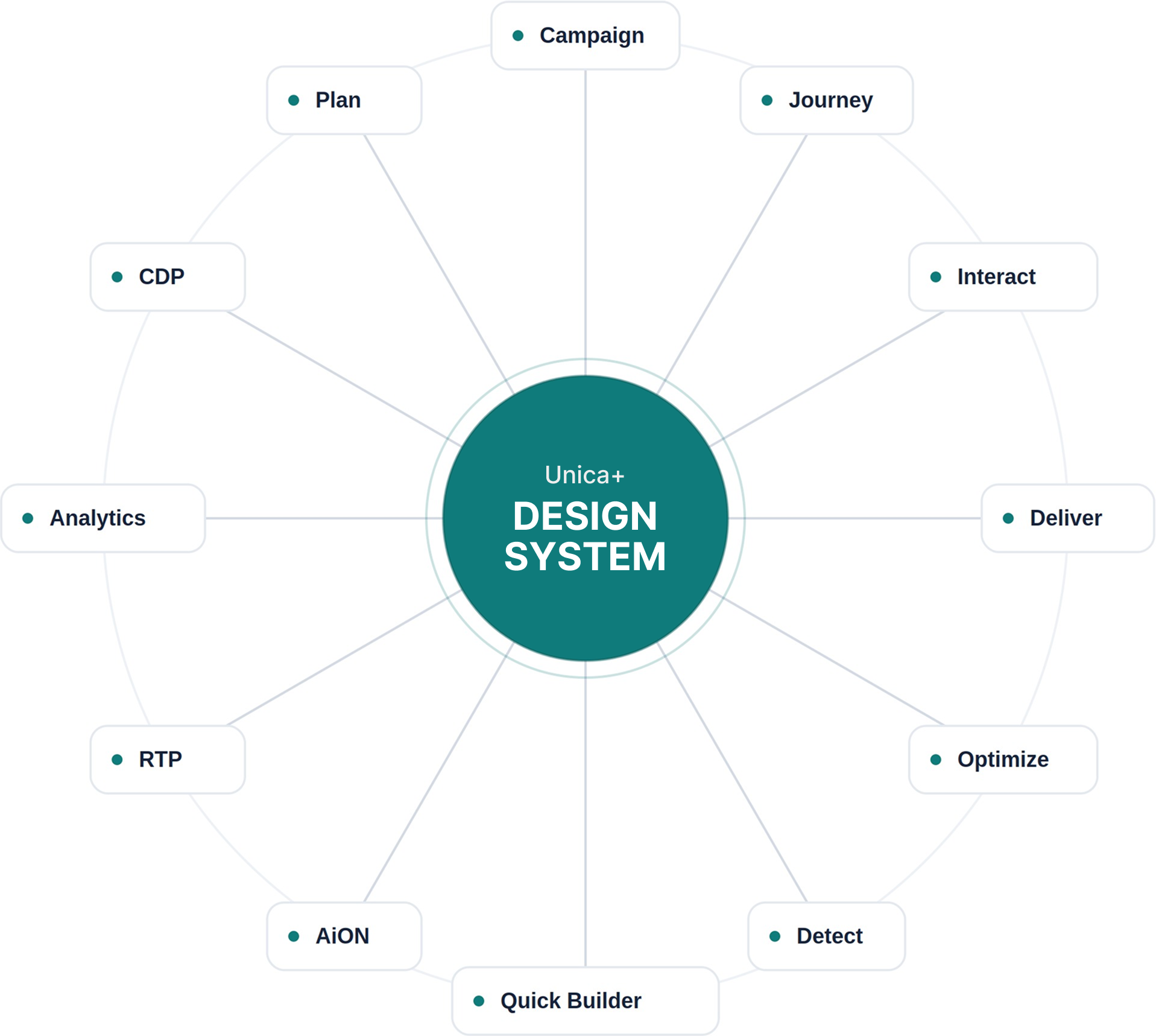
HCL Unica+ is an enterprise marketing platform, a suite of 15+ products (Campaign, Journey, Interact, Offer, Detect, Optimize, and more) built by different teams over many years.
Individually, each worked. Together, they felt like a dozen different apps sharing a logo. We took ownership of building one shared system of tokens, components, and documentation, so the whole suite finally felt like a single product.
03 · The Problem
Twelve products, and not one agreed on a button
errorInconsistent UI
The same "Save" action looked different in every product. Data tables varied everywhere.
errorSlow handoff
Designers redlined from scratch, engineers rebuilt the same components per product.
errorThe cost
Slow velocity, high defect rates, and a fragmented experience for enterprise clients.
Why leadership cared: inconsistency is not a cosmetic issue at enterprise scale. Every duplicated component is engineering time paid twice.
Every visual bug caught in QA costs more than one prevented at the source. And every inconsistent demo screen undermines the "one platform" story that sales tells enterprise buyers.
The design system was not a design initiative; it was an efficiency and revenue-protection initiative that happened to be led by design.
04 · Research
I started with an audit, not a design file
Inventoried
every recurring UI element and logged every variation.
Interviewed
designers, engineers, and PMs to map where handoff broke.
Quantified the drift
~27 button styles, ~15 input treatments, dozens of near-identical blues.
Benchmarked
against IBM Carbon, Salesforce Lightning, and Atlassian.
I began with evidence. A systematic component audit across the live products.
The audit surfaced 27 distinct button styles, 15 input treatments, and dozens of near-identical shades with no shared spacing scale. Almost every variation could collapse into a small, well-defined set.
05 · Process
This is how I built the system, layer by layer
5.1 · Design Tokens
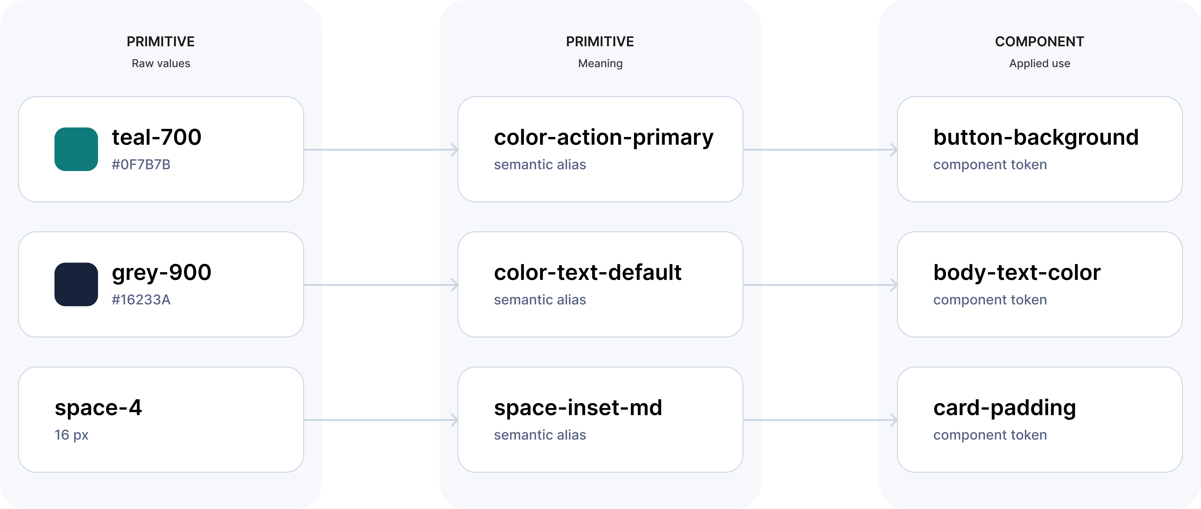
The single source of truth.
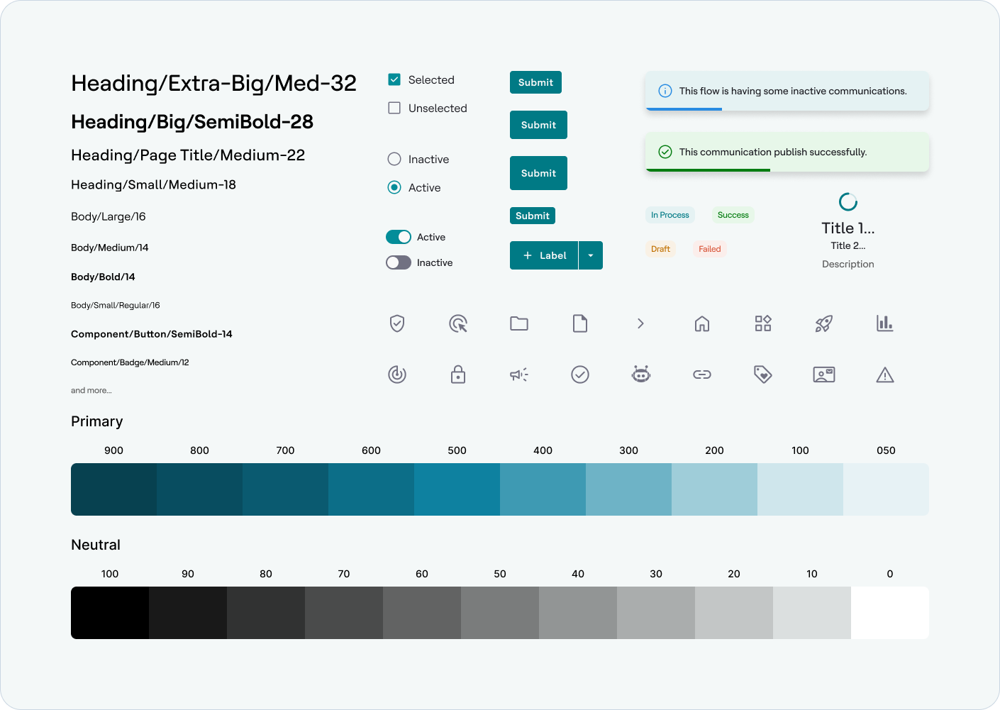
A three-tier architecture: primitive (teal-700) → semantic (color-action-primary) → component.
5.2 · Base Components
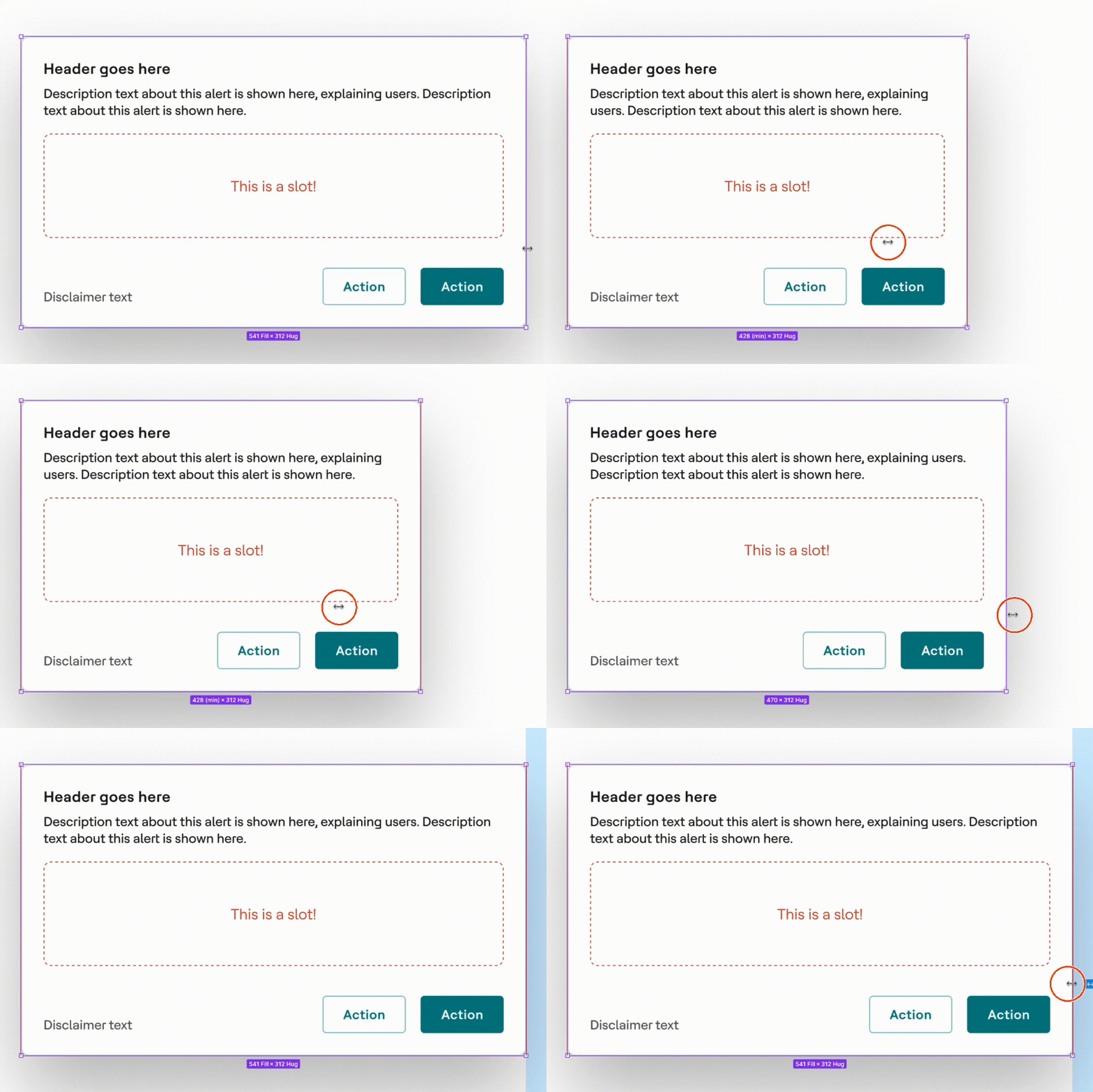
Built in Figma with Variants, and component properties, full states and sequenced by impact: buttons & inputs first, then data tables, then forms, modals, and navigation.
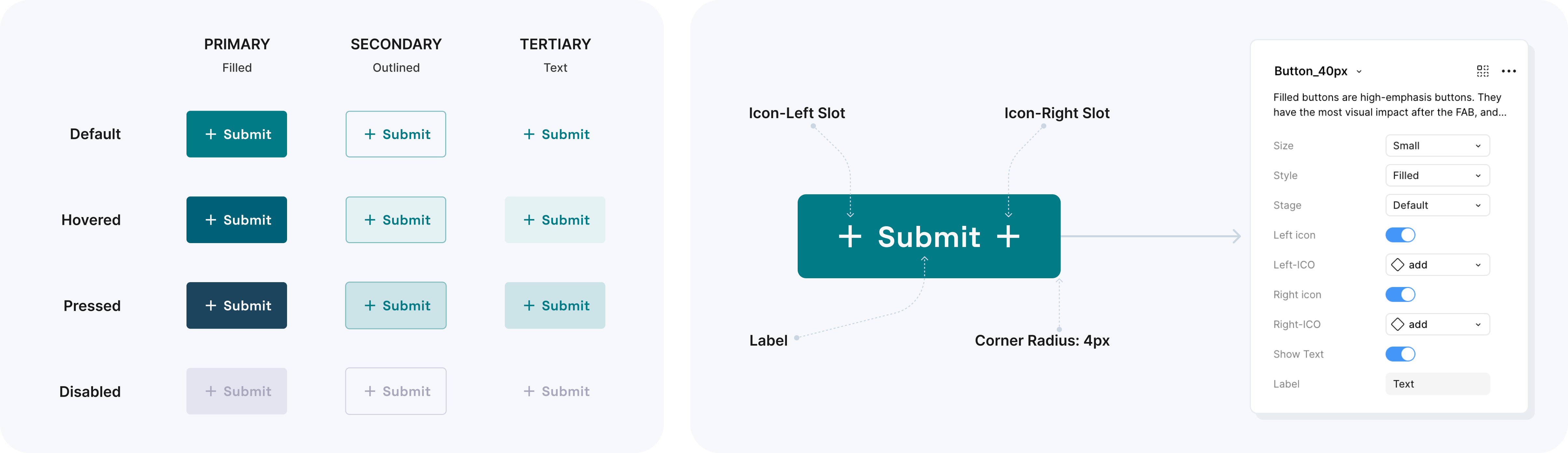
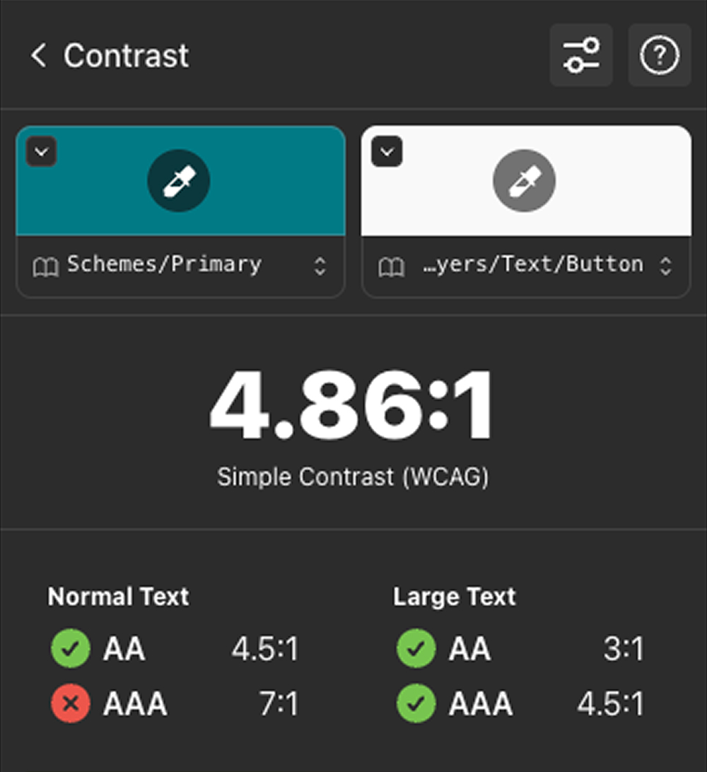
Every component shipped with Auto Layout and WCAG AA accessibility built in, not bolted on.
5.3 · Documentation & Governance
Each component came with usage rules, do's/don'ts, accessibility notes, and a code mapping so design and engineering shared one vocabulary. A lightweight governance model defined how teams request, review, and contribute, so it scaled without fragmenting again.
5.4 · Driving Adoption
Shipping the library was the easy half. The harder half was making 15+ product teams actually use it.
What I did:
- checkRan onboarding sessions with each product team and published migration guides per component.
- checkPartnered with engineering to map every Figma component to its coded counterpart, so adopting the design meant adopting the code.
06 · The System
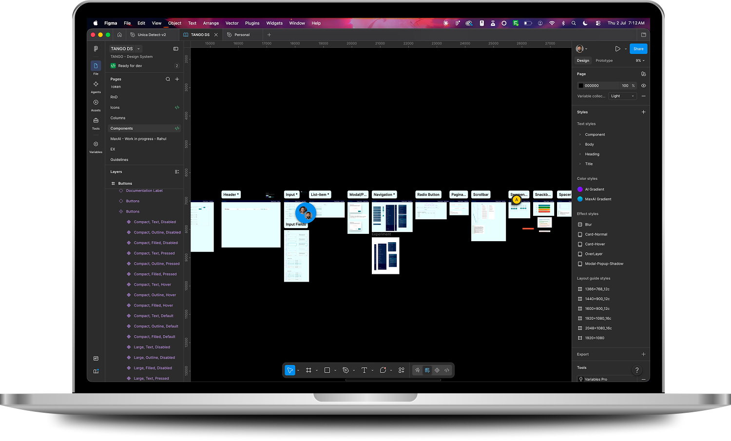
Everything came together in one Figma source of truth
A single source of truth in Figma, structured into Foundations (tokens, type, spacing, icons), Components (variant-complete, accessible), and Patterns & Templates. Built on Variables and Modes, it supports theming out of the box and stays in lockstep with the coded library.
07 · Impact
Here's what changed once teams adopted it
50%
faster design-to-development handoff (from weeks to days)
60%
reduction in UI defects reaching QA
50+ · 300+
components and variants adopted across 15+ products
WCAG AA
accessibility built into every component by default
Beyond the numbers: the suite now demos as one product, new products start from the system on day one instead of reinventing basics, and design conversations moved from "what should this button look like" to actual product problems.
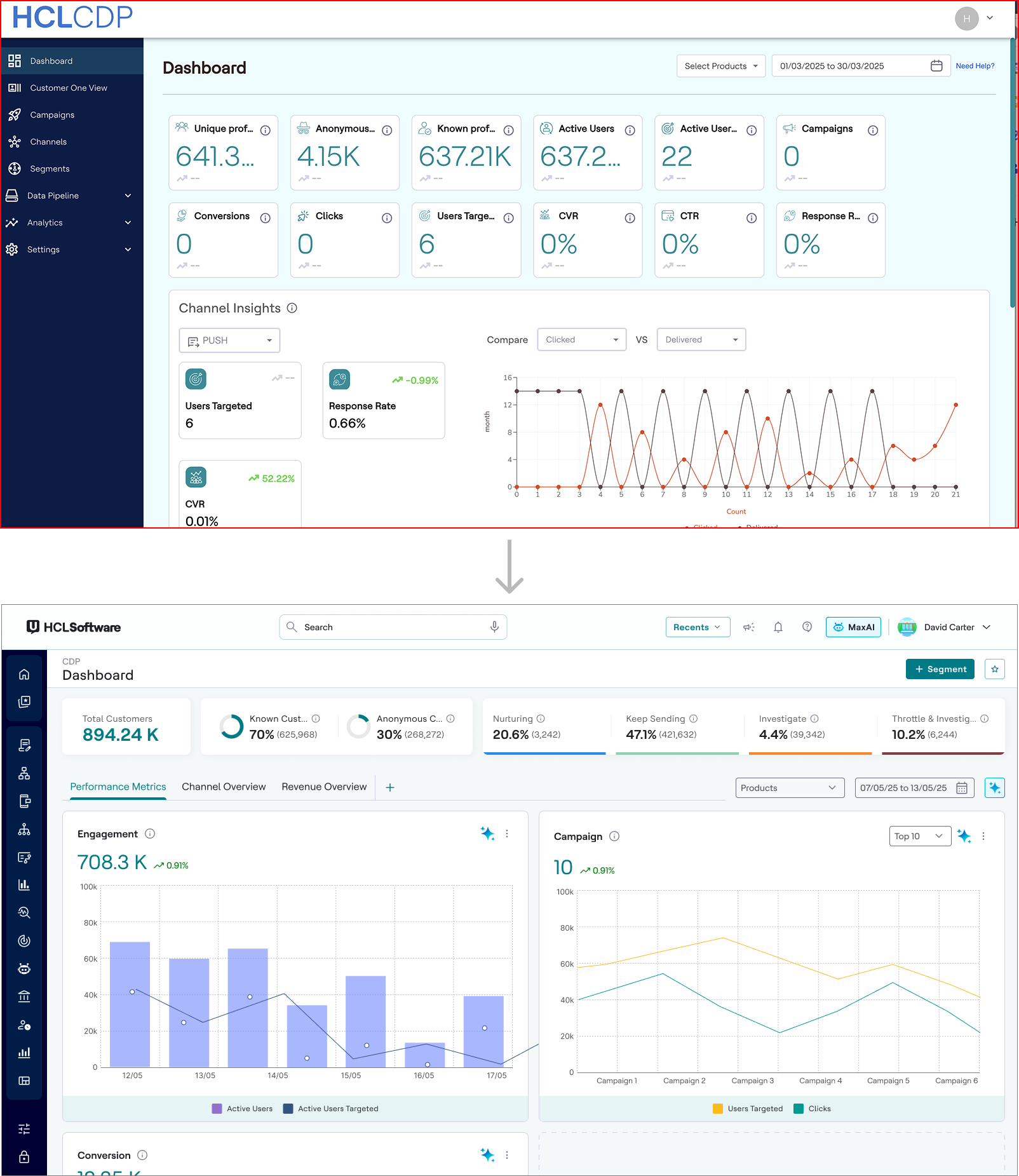
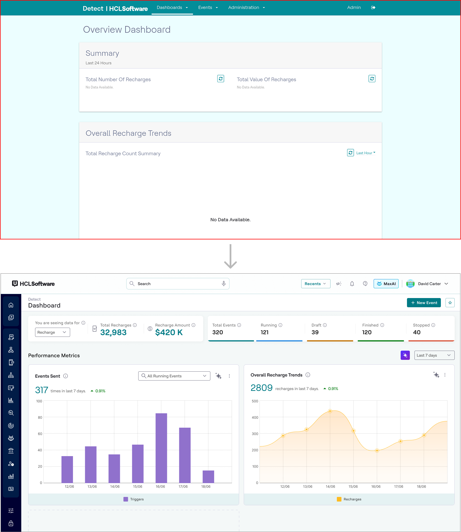
Before (top) vs. After (bottom): Redesign of enterprise products using a shared design system.
7.1 · Reflection
The hardest part was not the components, it was the politics of adoption: teams with deadlines do not pause for a design system unless it clearly saves them time.

Next case study
Modernizing User Behavior Targeting