SaaS Web Application
Modernizing user behavior targeting.
How I redesigned Detect, Unica's real-time behavior tool, so marketers can build event-driven campaigns without a data team.
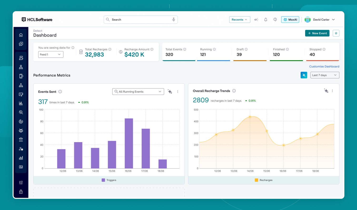
01 · Product Overview
Project Details
- Product
- Detect, part of the HCL Unica+ suite (15+ products)
- Role
- Senior Product Designer. UX, UI, AI interaction patterns, design system application.
- Domain
- Marketing, Martech
- Platform
- Web, Enterprise SaaS
- Goal
- Reduce time-to-value for marketers and lift Detect's usage within the suite
- Impact
- 60% faster event creation
Executive Summary
The brief was simple but hard: Detect had a powerful engine, but adoption stayed low because only technical users could operate it. I was asked to redesign it so any marketer could build a trigger on their own, without training or a data team.
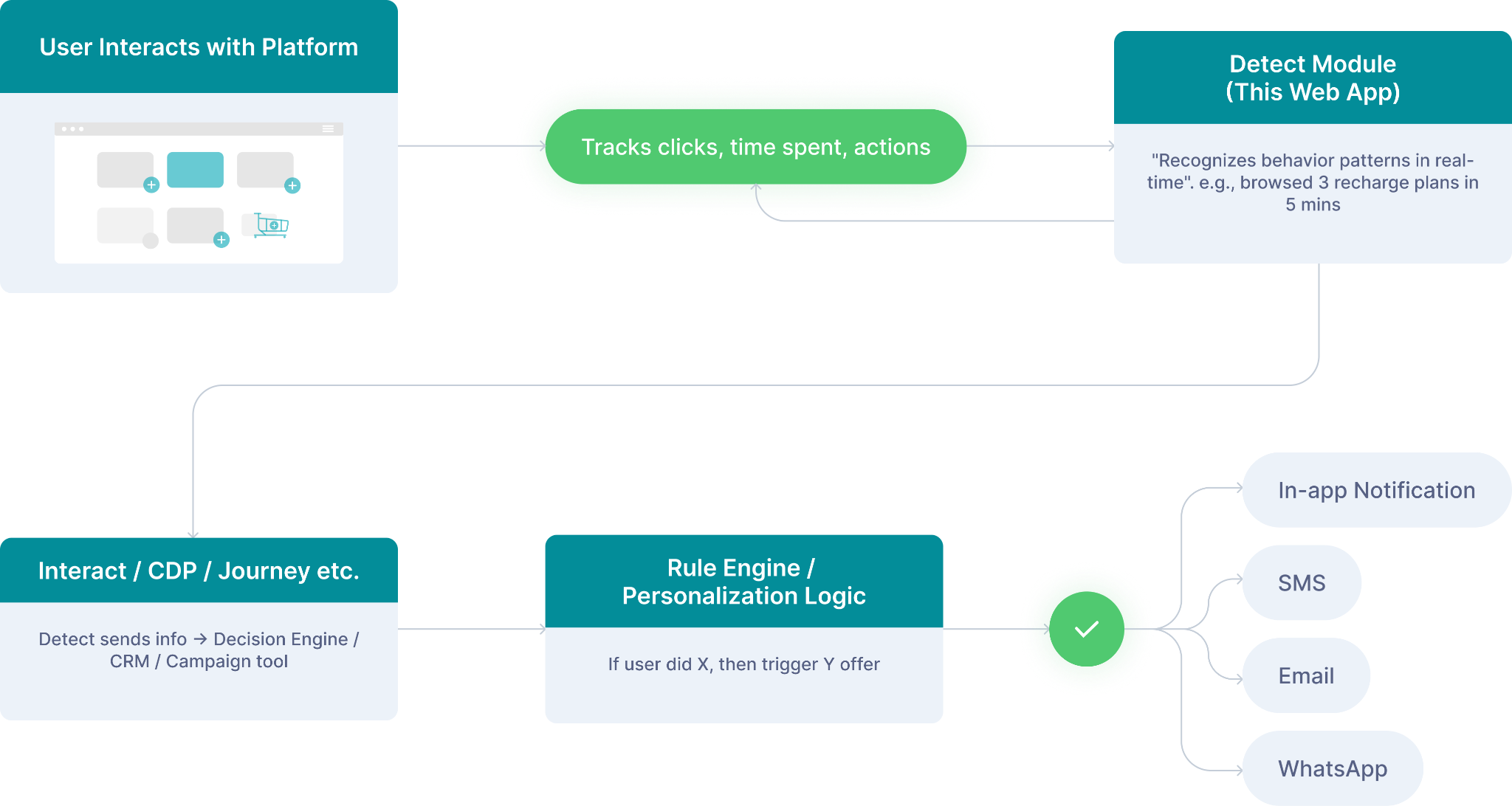
Detect watches real-time user behavior (say, someone views three recharge plans in five minutes) and triggers the right offer instantly. Powerful engine, but the old interface made it a specialist tool: marketers needed training or technical help to build even simple triggers, which throttled adoption of one of the suite's most differentiating capabilities.
I redesigned Detect end to end, and introduced AI-assisted segment creation so marketers can describe intent in plain language. The goal: turn Detect from an expert tool into an everyday one. Result: 60% faster event setup.
02 · Overview
What is Detect?
"Detect helps marketers understand real-time user behavior and send that data to other parts of the platform to trigger personalized offers or actions."
In simple terms: "If a user browses 3 recharge plans in 5 minutes", Detect can catch that and send this info to the right system so a special recharge offer can be shown instantly.
03 · UX Design
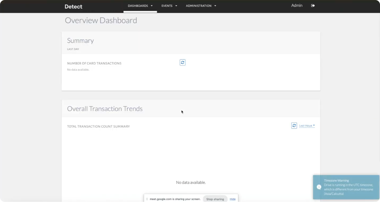
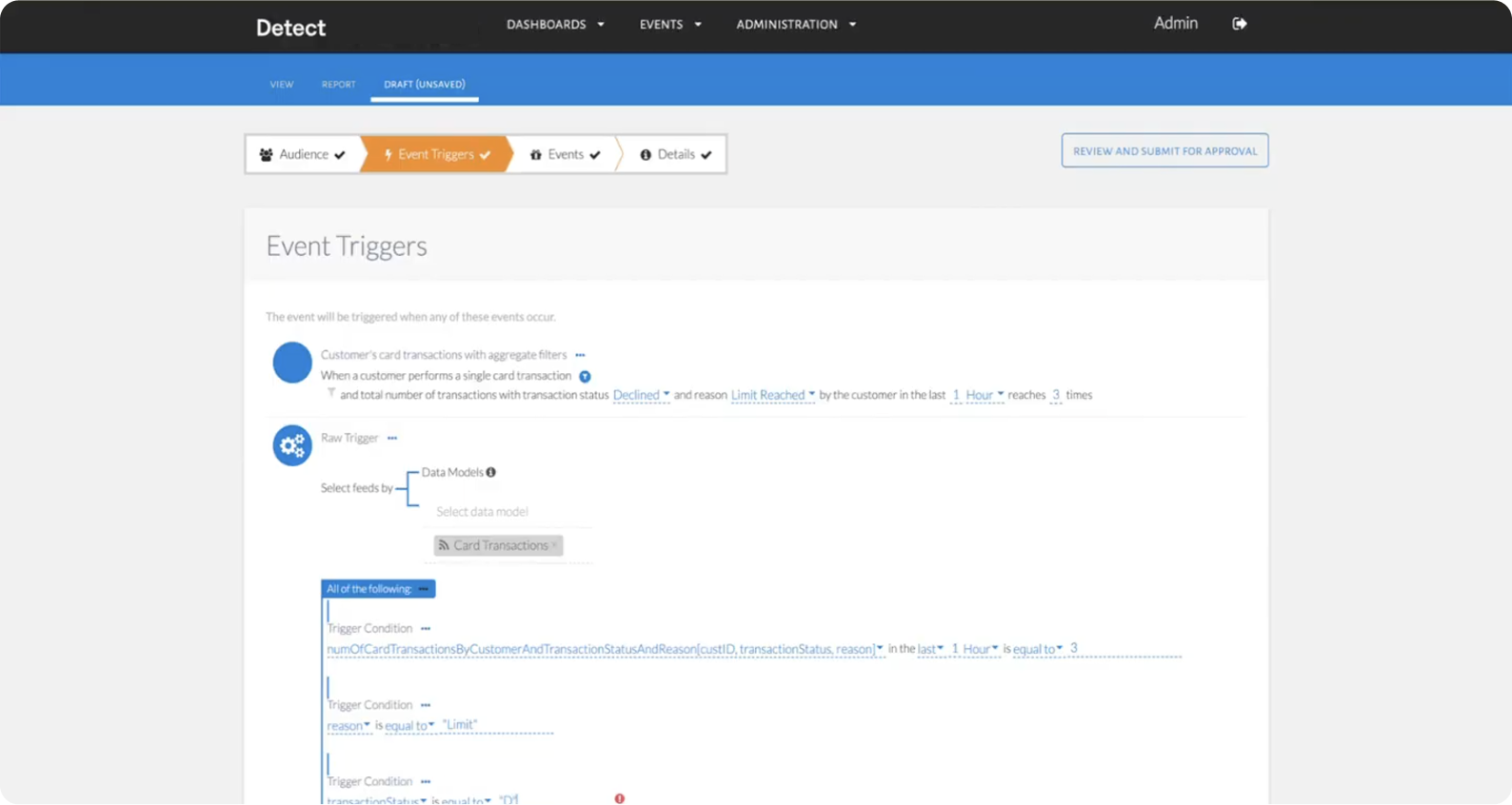
Old Detect struggled without a skilled product designer
errorCluttered Interface
Everything was visible all at once.
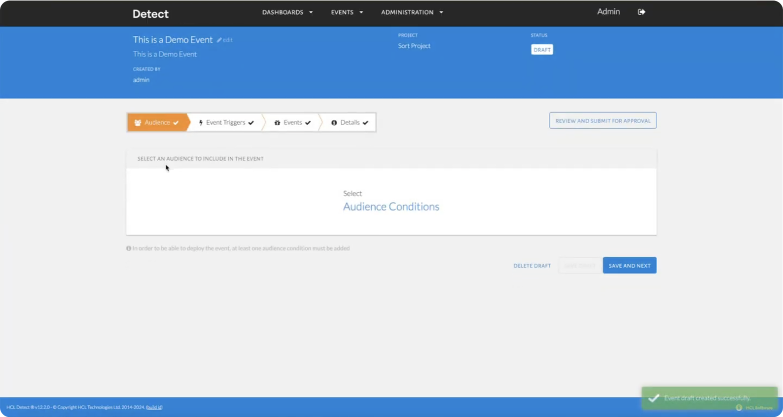
errorConfusing Rule Builder
Non-technical users felt lost.
errorInconsistent Design
No shared design language across tools.
errorCognitive Overload
Too many decisions in one screen.
3.1 · Old Screens
04 · Design
I took less than a week to get started with a redesign
To rebuild Detect as a tool that feels modern, intuitive, and engaging, I focused on four pillars:
Streamlined Flow
Simple 4-step event creation.
Gamified Touches
Progress indicators, completion status.
AI-powered Suggestions
Smart nudges for better targeting.
Design System
Modular, reusable, consistent components.
And my design priorities were,

05 · Design
That is how the redesign process looked like
Now let us zoom in on how the redesign came together, step by step.
5.1 · UX Audit
Before opening Figma, I deconstructed the old Detect into user flows, then into individual data blocks and cards, to understand the role of every element.
Then I ran a heuristic audit to surface the experience problems.
5.2 · Wireframing
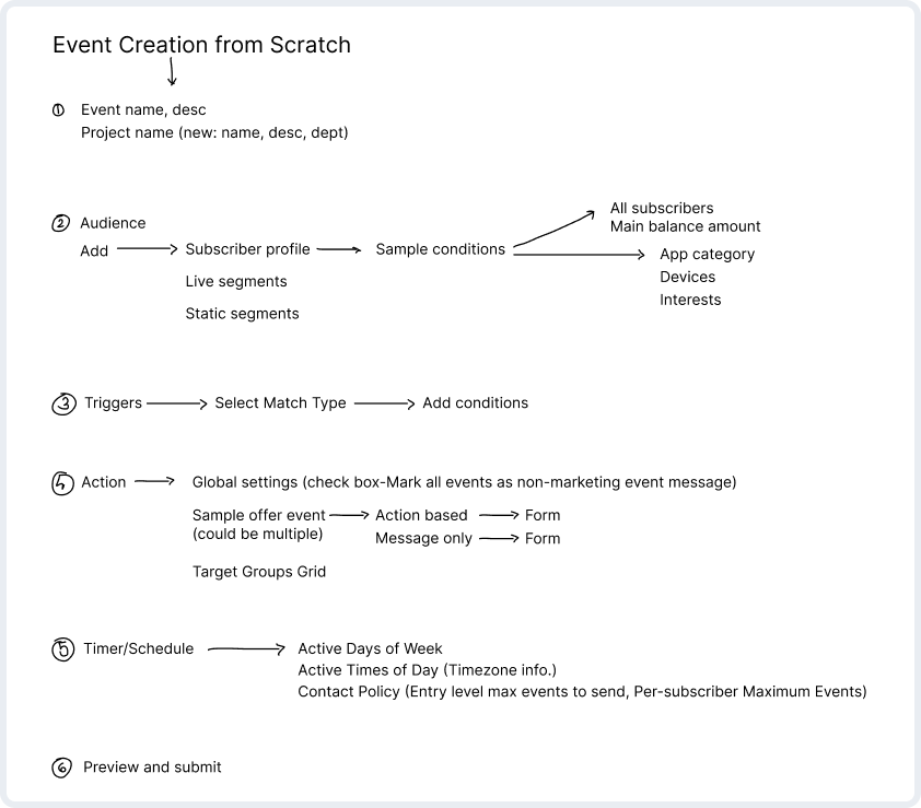
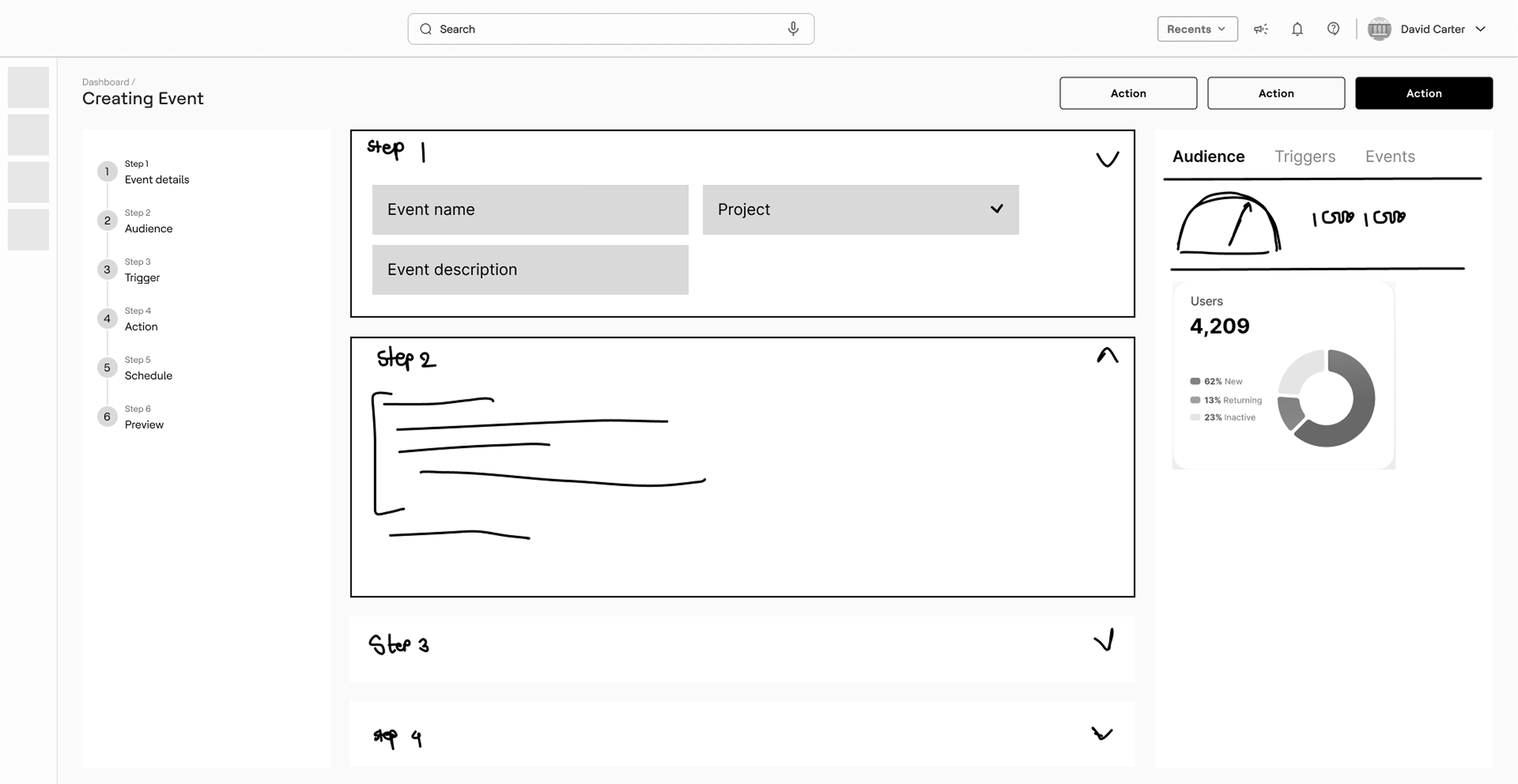
To recreate the web app's screens and user flows using design best practices, I started with raw wireframes. They helped to outline the arrangement of the elements on the future interface.
Later, raw sketches turned into high-fidelity wireframes, a series of thought-through screens that illustrate each element and the connections between them. After the concept got approved by the stakeholders team, i proceeded to the visual direction.
5.3 · Doing Visual Design
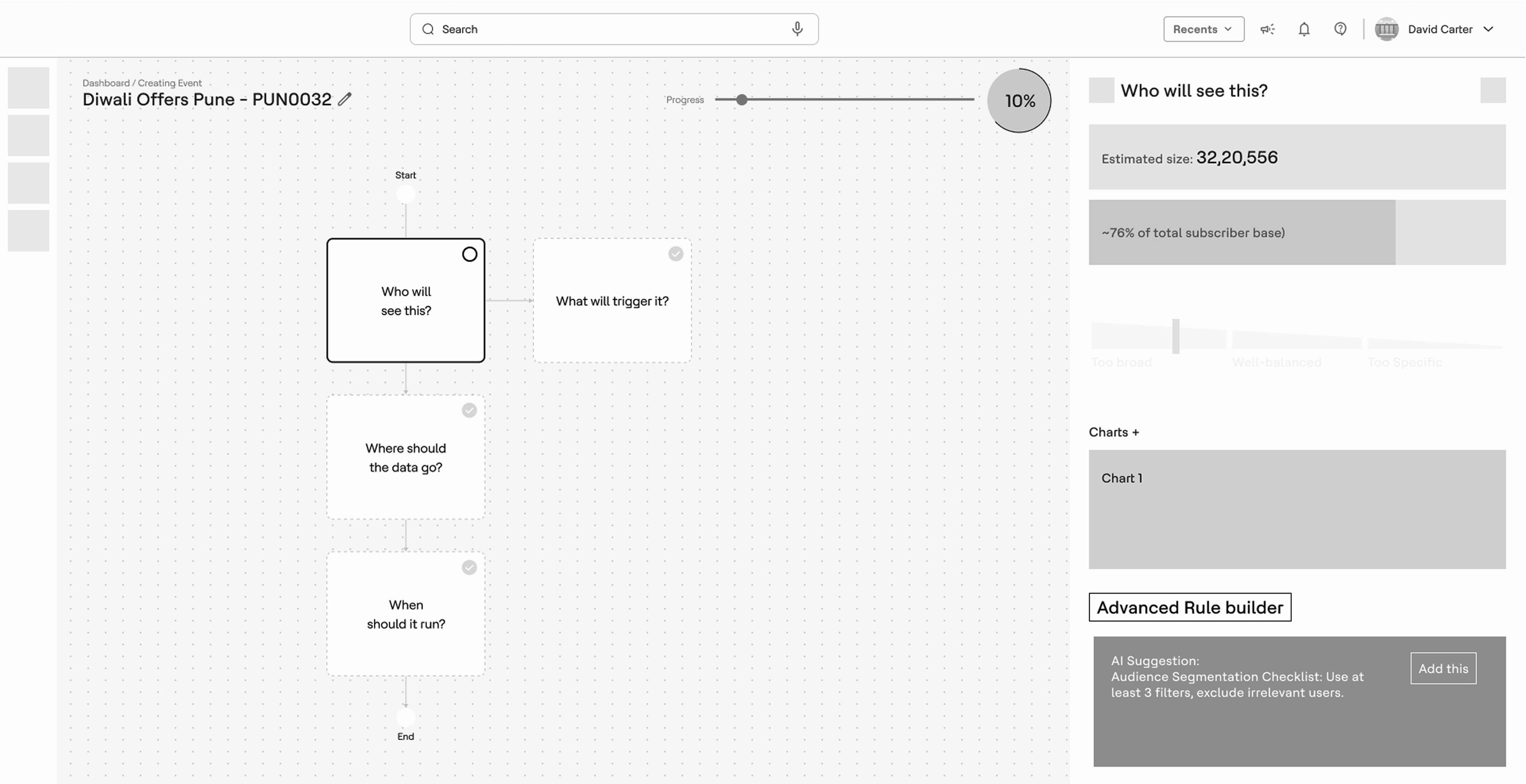
The visual layer applies the Unica design system I built, so Detect stopped looking like an outlier and started looking like part of the suite. Dense data views were reorganized around the marketer's questions: what is running, what is working, what needs attention.
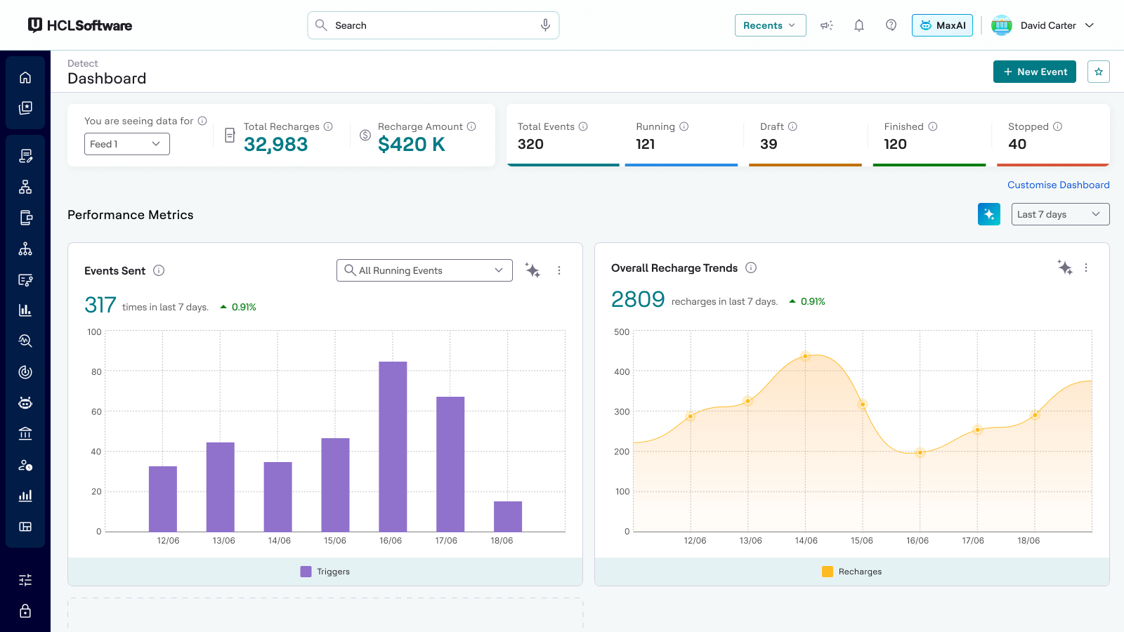
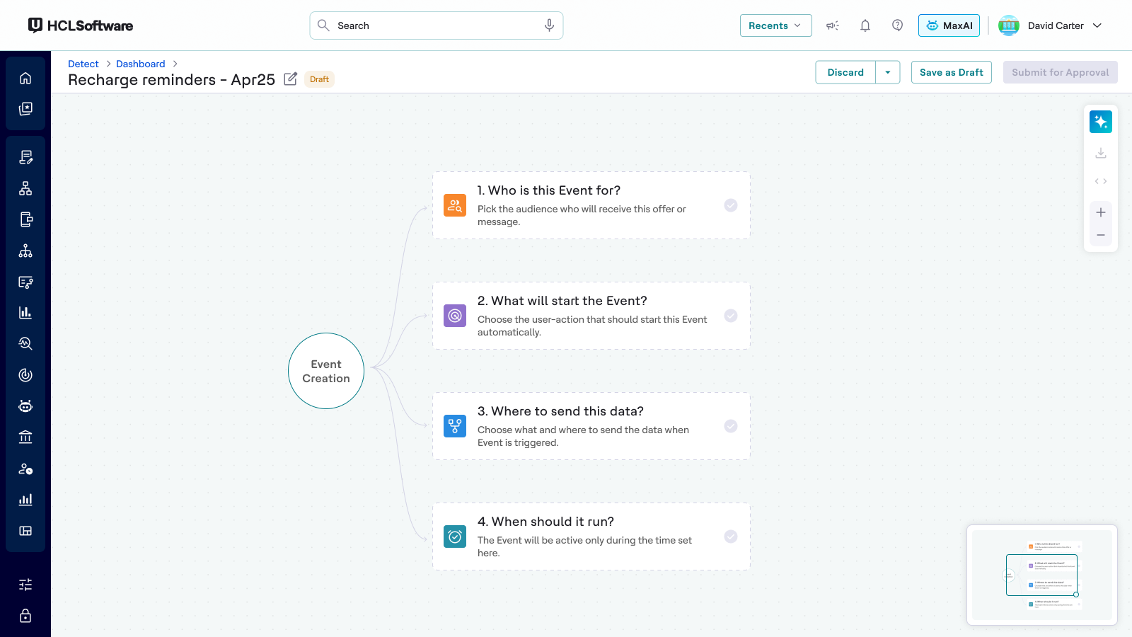
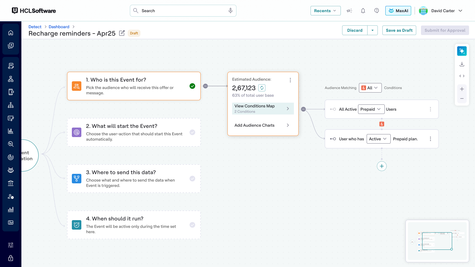
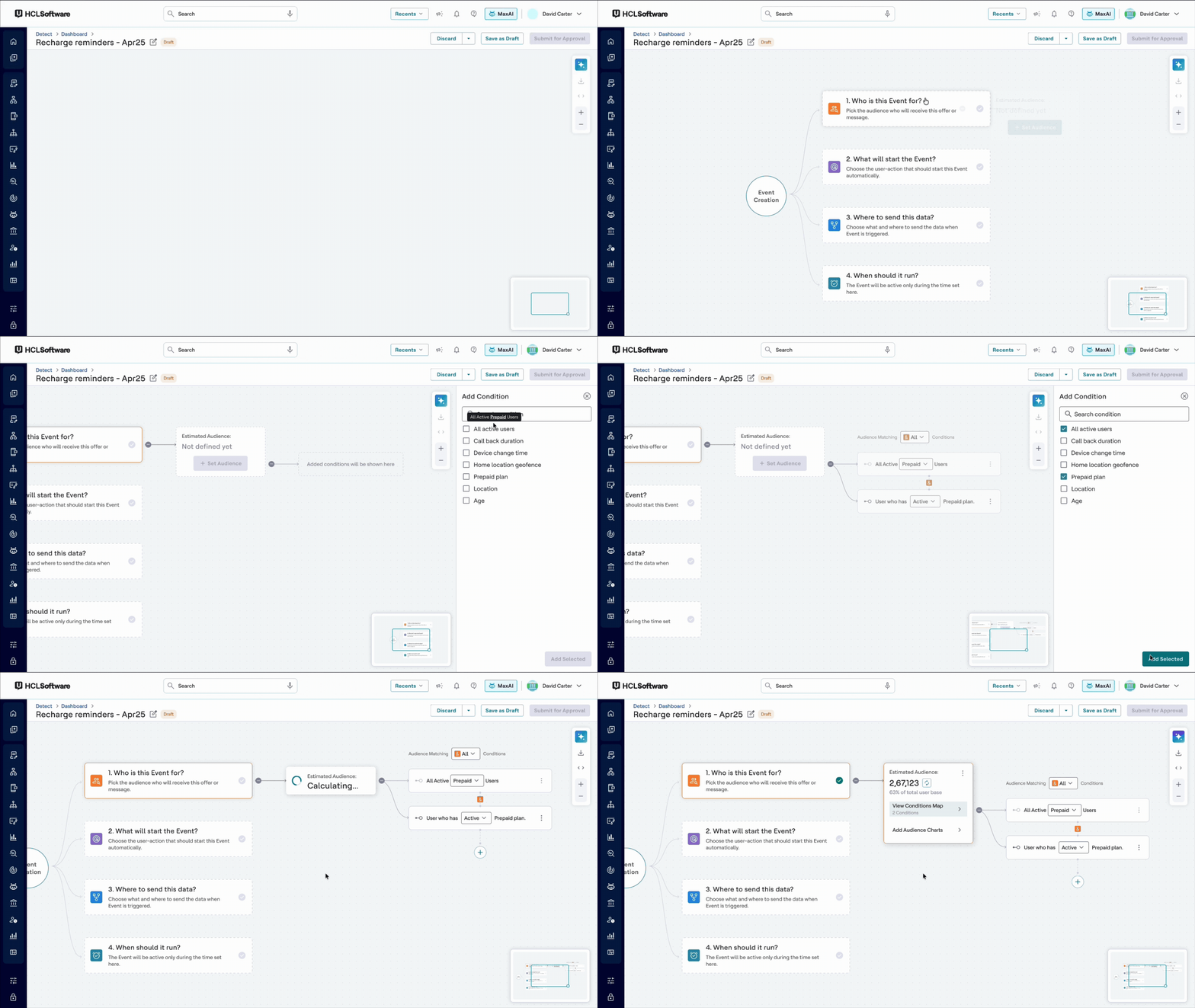
Event Creation Flow · The New User Flow (Simplified)
Step 1
Who will see this event?
Define the audience. Integrated AI helps with segment suggestions.
arrow_right_altIncludes smart filters, audience count preview, and charts.
Step 2
What will trigger the event?
Choose the behavior to watch (e.g., clicked a page, searched for data).
arrow_right_altSimplified rule builder with natural language-style logic.
Step 3
Where should the data go?
Decide if data is sent as a simple message or tied to a user action.
arrow_right_altClear separation of "Message only" vs "Action based" logic.
arrow_right_altAllows targeting sub-groups of audience with ease.
Step 4
When should it run?
Set timing or frequency constraints.
arrow_right_altAdded slider-style controls and clear feedback.
5.4 · Use of AI
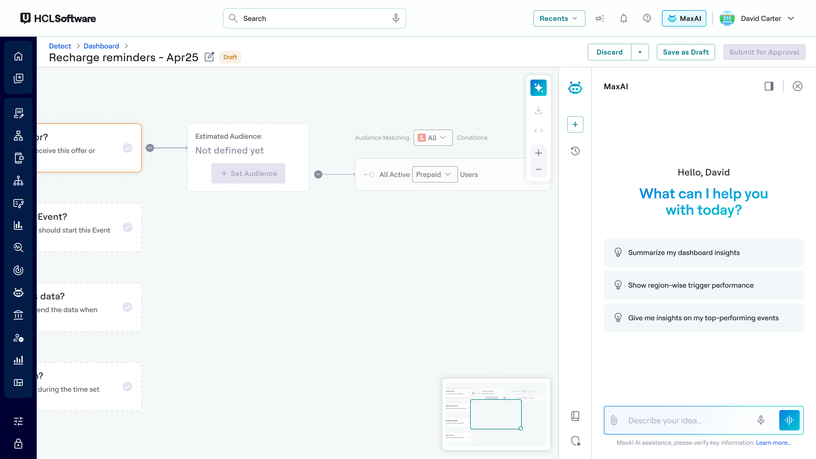
The biggest barrier was segment creation: users had to translate marketing intent into technical criteria. The redesign lets a marketer type intent in plain language ("users who search iPhone 18 on browser"), and AI parses it into real, editable segment suggestions.
Design challenges I had to solve: making AI output trustworthy (always show the underlying criteria, never a black box), keeping the user in control (suggestions are editable, not auto-applied), and handling failure gracefully (when AI is unsure, it asks instead of guessing).
This pattern also became the reference for AI-assisted flows in other Unica products.
5.5 · Designing the Rule Builder
The rule builder is the heart of Detect. It is where a marketer defines the logic: who to watch, what behavior to catch, and what should happen next. It is also where the old product lost people. Rules were written in dense, technical rows that looked more like a database query than a marketing tool.
I designed two different rule builders and put them in front of users, because the team was split on what "simpler" actually meant.
5.6 · Version 1: The Mindmap Builder
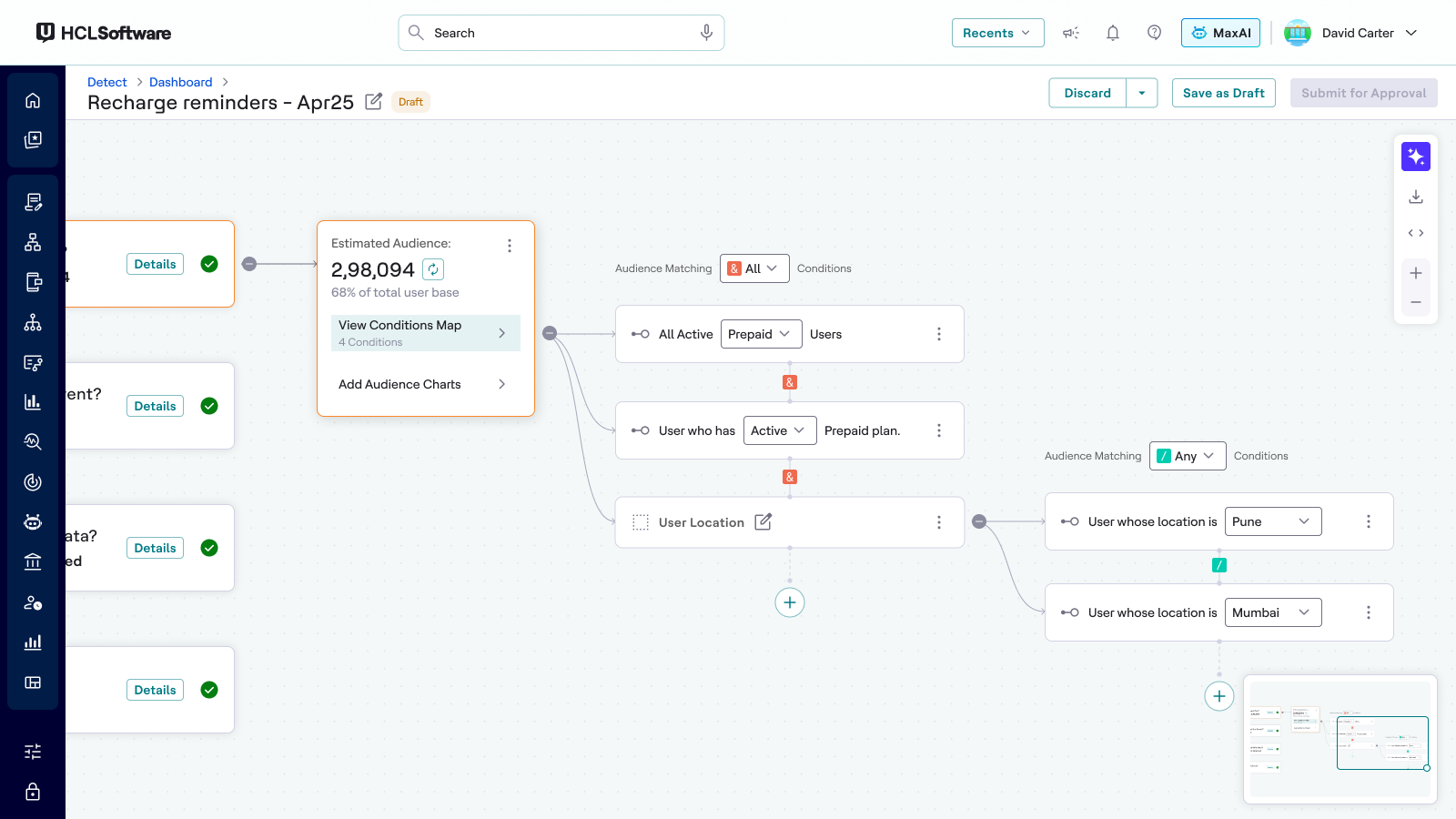
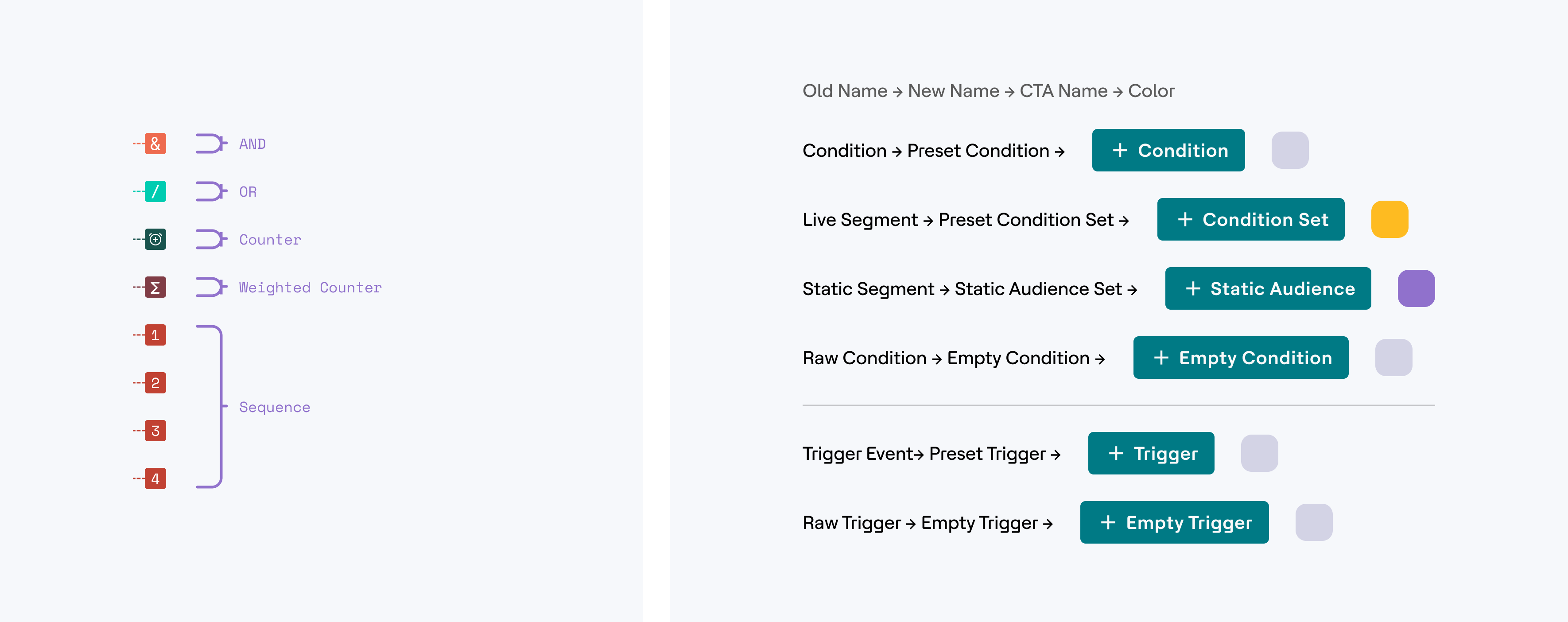
Complex rules are not lists, they are trees. So the this version draws the rule as a visual map: the audience at the center, branches for each condition group. Marketers can see the whole logic at a glance, drag branches to restructure, and spot dead or conflicting paths that were invisible in row form.
5.7 · Version 2: The Structured Builder
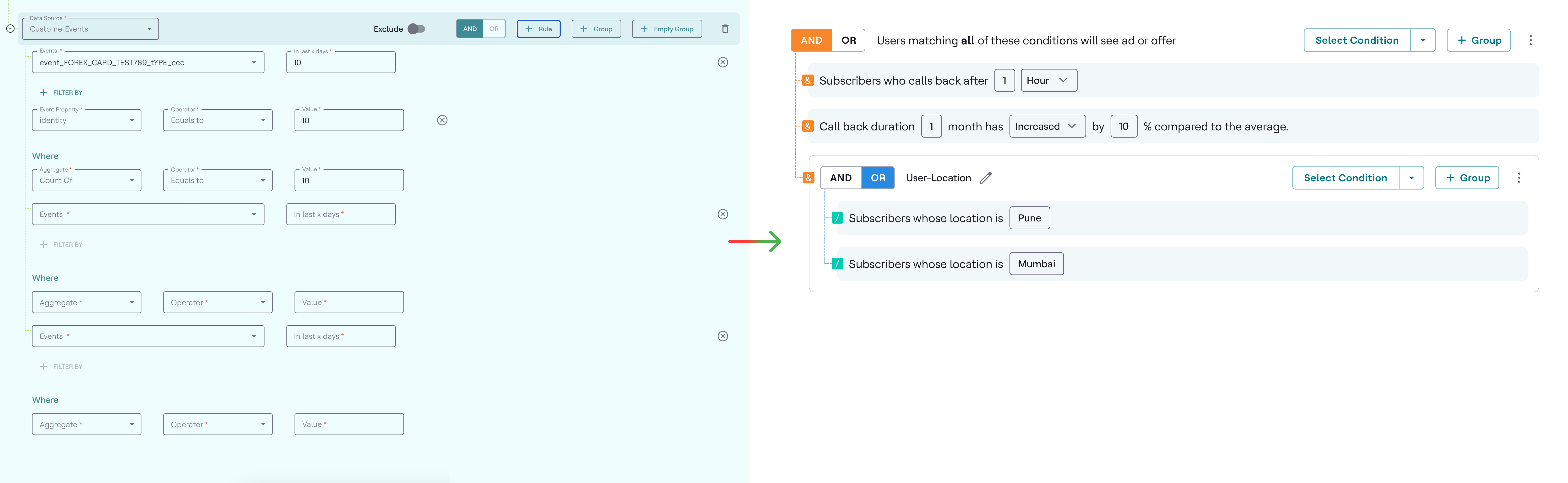
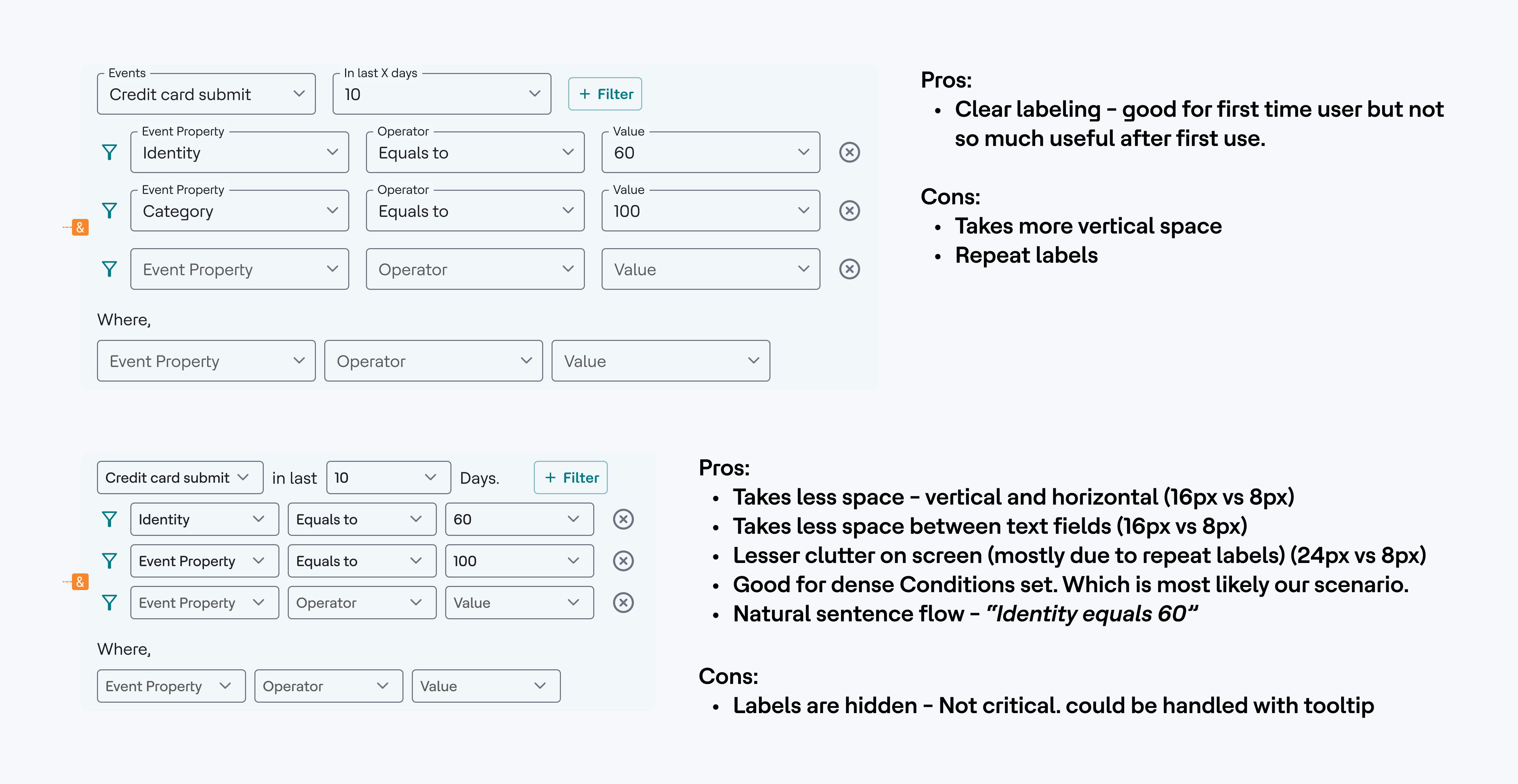
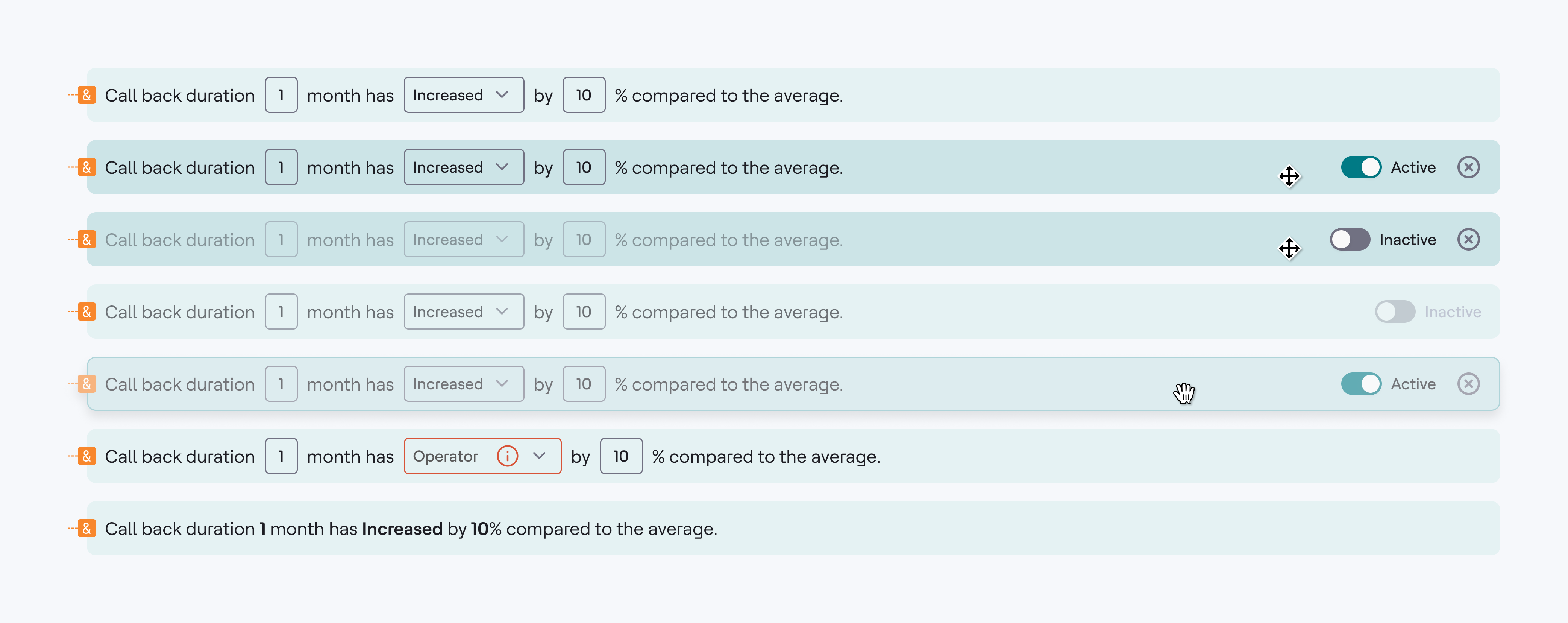
For places other than full screen canvas we needed linear rule builder. We had one but it was difficult to scan and understand, especially when creating complex nested conditions. I redesigned the experience to improve clarity, scalability, and usability.
Key Improvements
- checkImproved visual hierarchy with grouped conditions.
- checkIntroduced clear AND/OR containers for better logic understanding.
- checkReduced visual clutter using a cleaner, card-based layout.
- checkMade actions more contextual and easier to discover.
- checkEnhanced readability with consistent spacing and alignment.
- checkDesigned a scalable structure for complex rule combinations.
5.8 · What we learned
Simple rules were faster in the structured builder. Complex rules were dramatically easier to understand in the mindmap. The insight was that these are not competing designs but two views of the same rule, one for writing quickly for smaller places and one for understanding deeply for larger spaces. That framing settled the internal debate and shaped the direction of the final product.
This was also my favorite kind of design problem: not polishing one answer, but building two honest alternatives and letting real usage decide.
5.9 · Design System and Interactions
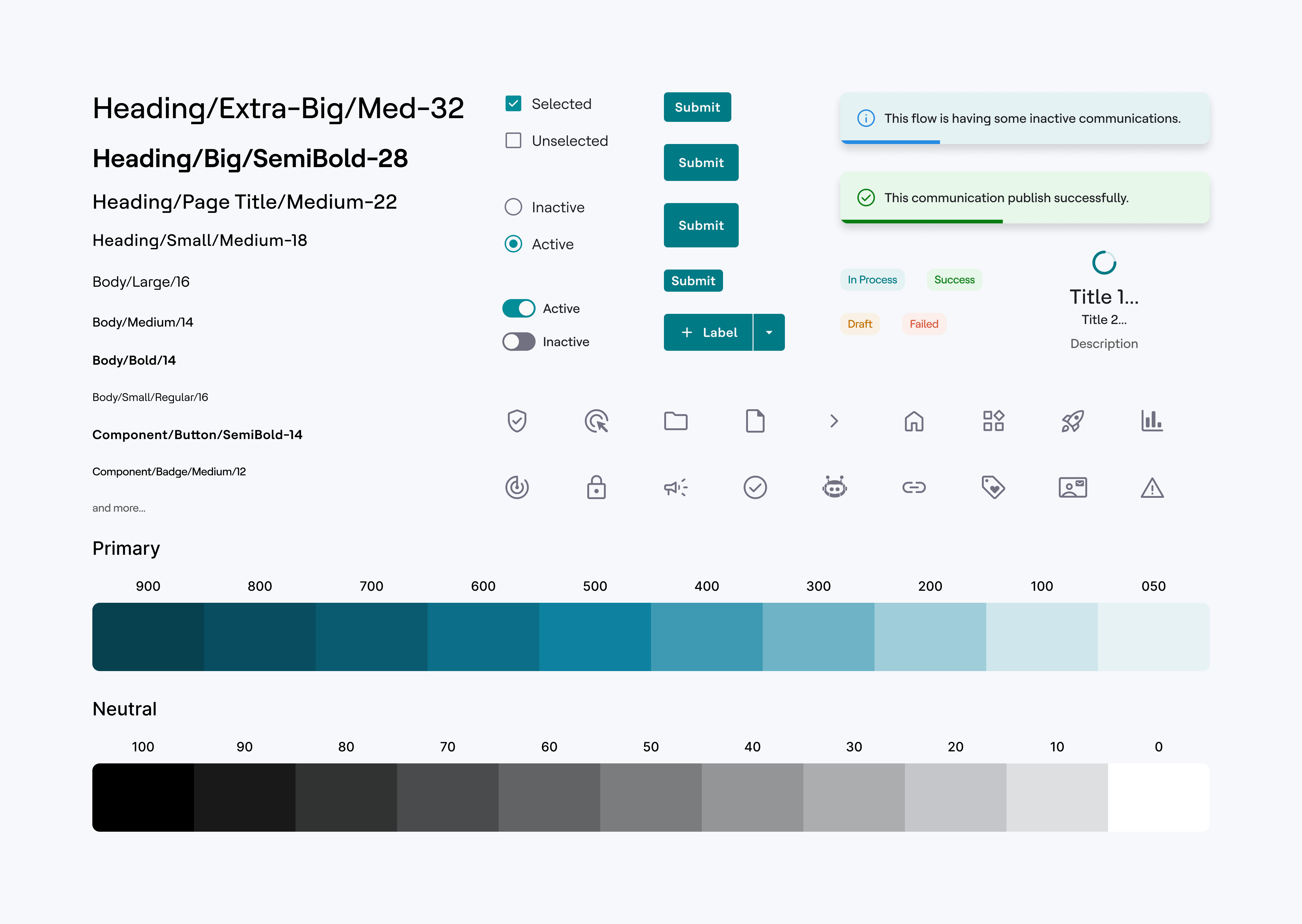
To support the redesign, we built a flexible and scalable design system:
- checkReusable components across tools
- checkUnified styles and grids
- checkMicro-interactions for clarity (e.g., hover states, loaders)
- checkAnimations for onboarding & feedback
5.10 · Validation
We pressure-tested the flows in weekly reviews with product managers and sales engineers who demo Detect to clients, and iterated on their objections.
06 · Outcomes
I managed to fix the overcomplicated UI/UX and helped Detect to get fresh look.
Simplified UI led to faster event creation.
Rule-building now feels more guided and intuitive.
Increased engagement from first-time users.
Design system adopted by other products in the suite.
6.1 · Impact
60%
Event setup time cut from about 5 minutes to 2. (Task: Time to add 7 trigger conditions divided in 2 groups)
100%
Detect now ships on the Unica design system: 100% of its UI uses shared components, which cut its front-end effort by ~50%
6.2 · Reflection
Detect taught me that in enterprise software, "delight" is speed and confidence: the marketer who builds a working trigger in two minutes without asking anyone for help is the delighted one.

Next case study
Designing the Connected Home