B2B Web and Mobile
B2B Logistics Scanning and Delivery Platform
Mobile app, Zone Management Portal, and Customer Portal
- Role
- UX/UI Designer: hi-fi wireframes and visual design
- Product
- B2B logistics delivery and parcel-tracking platform
- Skills
- Information architecture, Wireframing, UI design, Style guide, Agile collaboration
- Platform
- Android app plus two web portals (Zone Management and Customer)
Executive Summary
Warehouse workers and drivers juggled heavy scanners, separate navigation devices, and paper processes. We designed one platform: an Android app for scanning, navigation, and proof-of-condition photos, plus two web portals for zone management and customer tracking. My role: information architecture, high-fidelity wireframes, and visual design across all three surfaces.
2 · Introduction
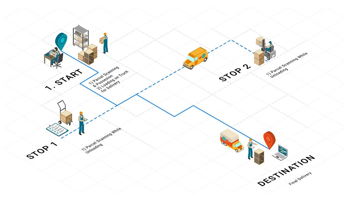
This B2B logistics service delivers shipments to stores, dealers, and branches. One of its key selling points is simple: order by the afternoon, and delivery arrives by the next morning. A large logistics network lets the company build dedicated or shared solutions that meet client expectations and improve productivity.
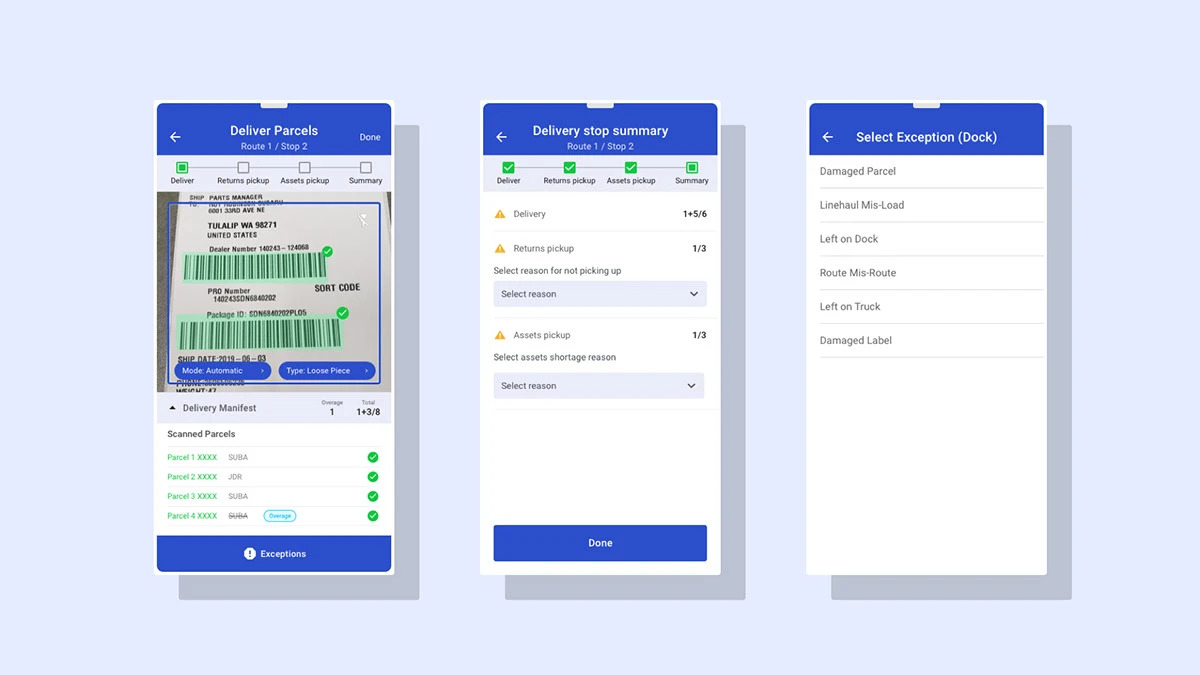
Every parcel is first received and scanned at the parts distribution centre, where an optimal route is created for each shipment. Drivers then scan parcels as they load and unload them from the truck during delivery, and mark any that are damaged, missing, or misrouted. This keeps customer service informed and lets them update dealers on every shipment.
3 · User and Business Goals
All parcel scanning is done with handheld scanner devices, and workers and drivers use separate devices to track deliveries and to navigate. Here is what we found.
User Frustration
- priority_highThe scanner is heavy and does not fit in a pocket.
- priority_highWorkers and drivers get no visual feedback when a scan succeeds.
- priority_highThe app is hard to use on small screens, and the small buttons are difficult to tap while wearing gloves.
- priority_highDrivers have to switch to a separate device for navigation while delivering.
- priority_highDrivers cannot take photos of damaged parcels, so they are sometimes blamed for damage they did not cause.
- priority_highThere is a lot of manual work, which makes the learning curve steep for new staff.
User Goals
- checkComplete every task in one system, with as few errors as possible.
- checkFinish the scanning process faster.
- checkProtect drivers from being blamed for problems they did not cause.
- checkKeep customers and dealers updated in real time.
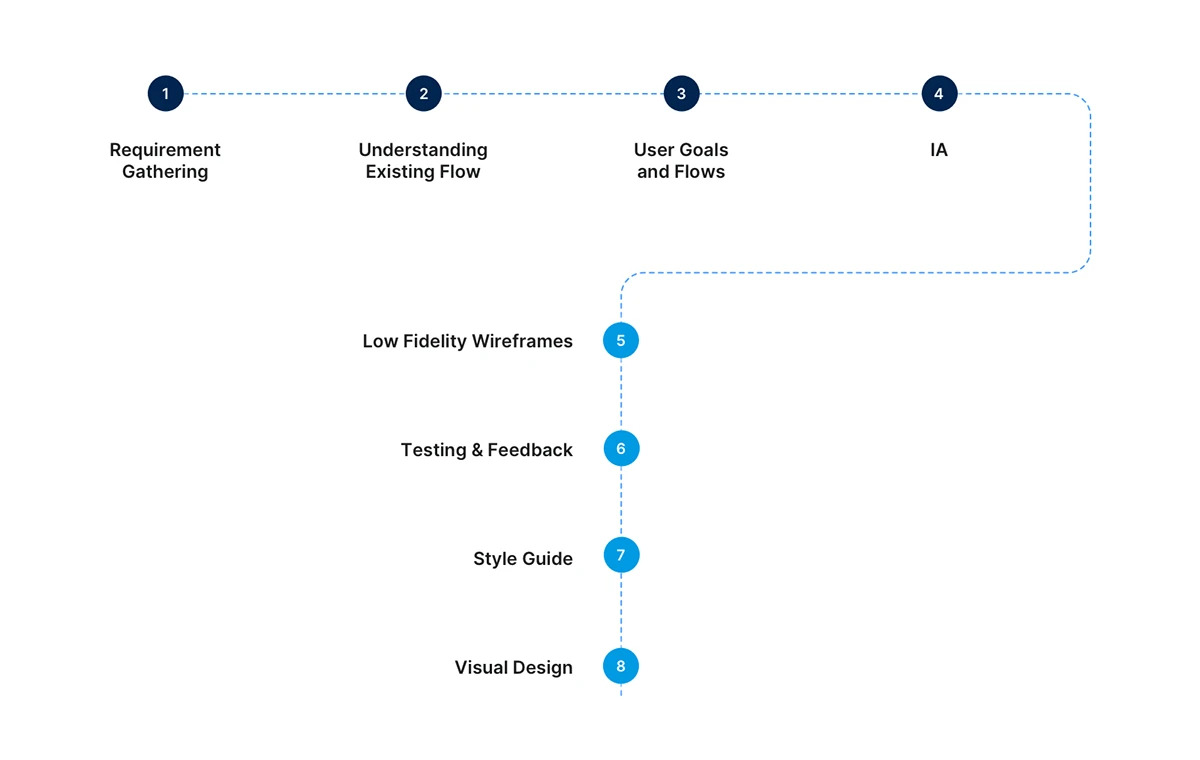
4 · Design Process and My Role
I was responsible for the high-fidelity wireframes and visual design across the whole product: the mobile application, the Zone Management Portal, and the Customer Portal. I worked within an agile, cross-functional team alongside developers, a project manager, and the client team.
We were building the entire experience from scratch, so feedback came in constantly. My job was to turn that feedback, from stakeholders, clients, and real users, into clear UI changes.
5 · Information Architecture
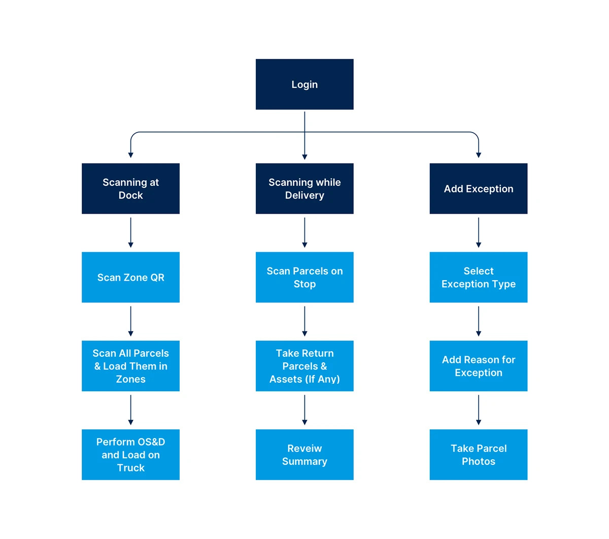
Using the requirement documents we were given, we turned the list of features and our analysis into an information architecture. After a few rounds of revisions to resolve early design issues, we had a structure that was ready for wireframing.
6 · Wireframes
After a couple of iterations, we created wireframes for each user flow. Combining client feedback with our own analysis, we prepared a final set of detailed wireframes.
7 · Designing for Two Surfaces
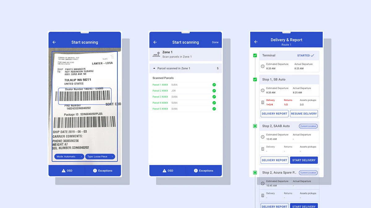
The driver on a loading dock and the manager at a desk need the same data in opposite forms. The Android app was designed for gloves, glare, and speed: large tap targets, instant scan feedback, high contrast.
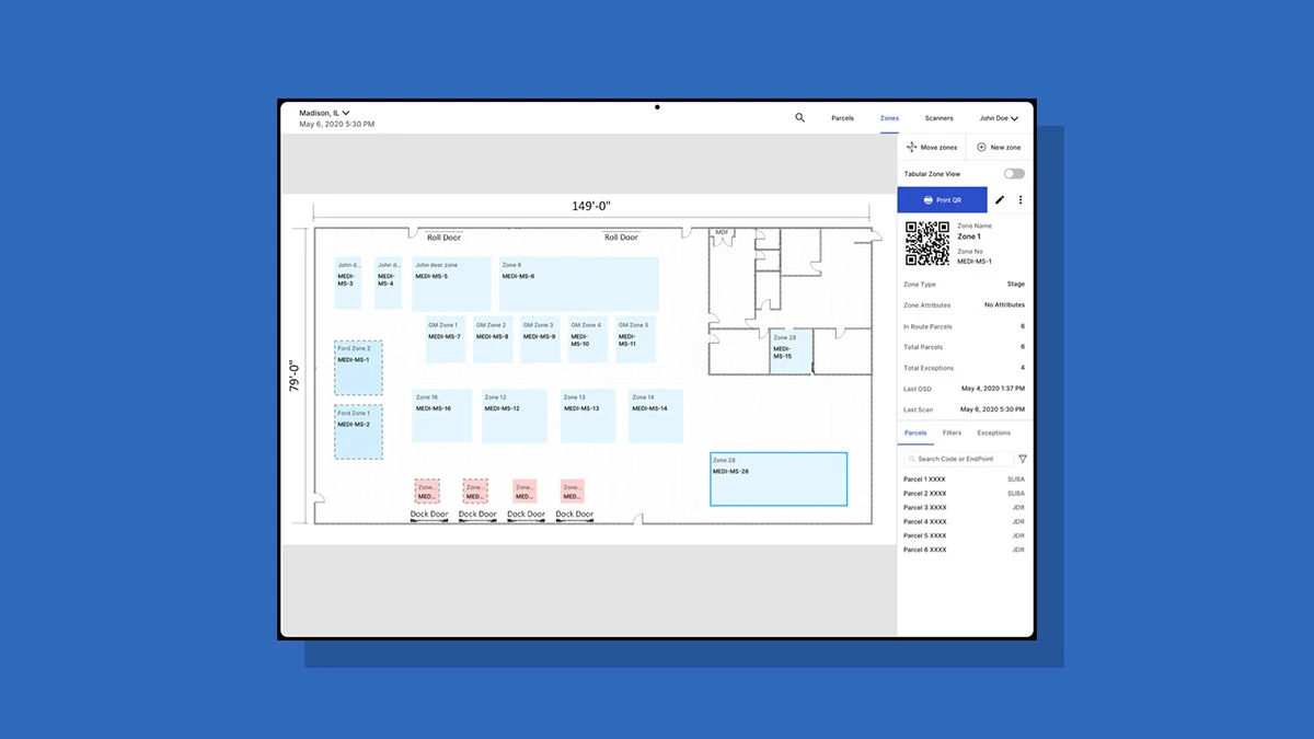
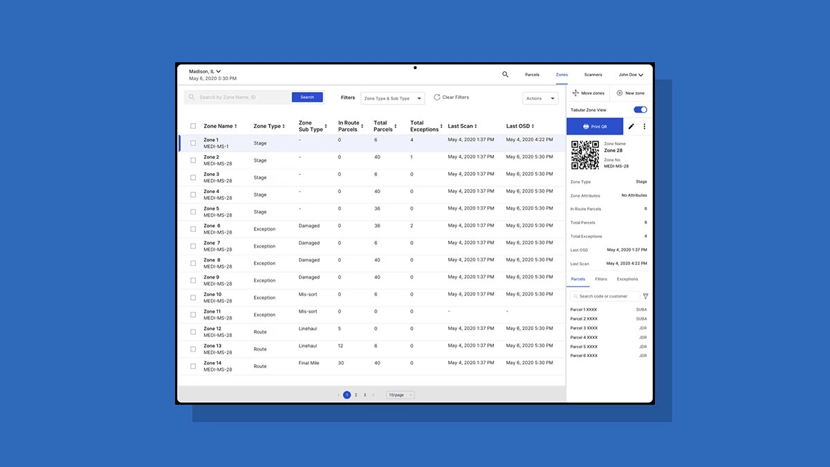
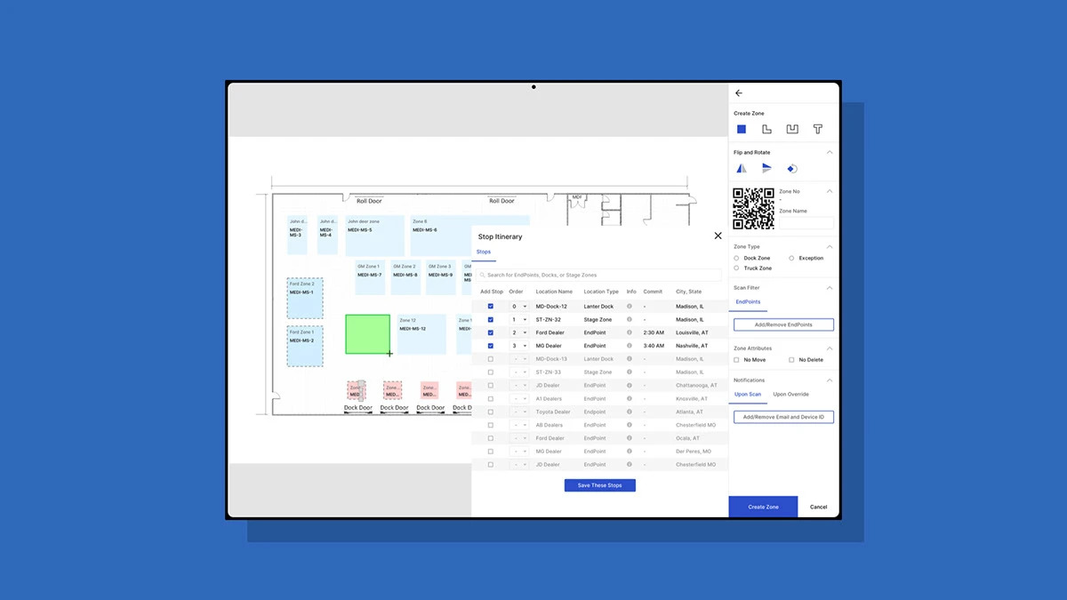
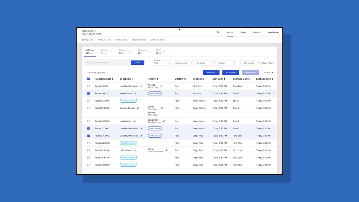
The web portals were designed for oversight: dense tables, filters, and status at a glance. A shared style guide (one blue, one status color set) kept them visibly the same product.
8 · Style Guide and Visual Design
Because this was an enterprise application with supporting portals, we kept the UI as simple and efficient as possible. We had followed the UX process carefully, so the visual design was fairly straightforward.
For the mobile app, we used standard Android UI components. For the web portals, we created a custom style guide. We chose a shade of blue as the primary color, with additional colors for common states like success, failure, and processing.
Below are the UI screens for the Zone Management Portal, the Customer Portal, and the mobile application.
Thank you!
Next case study
Bringing Order to Chaos